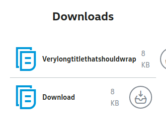
By default, flex items won’t shrink below their minimum content size
这意味着项目的最小宽度被设置为其内容的宽度,并且不会缩小到该宽度,所以这里使用overflow: hidden无法让其收缩。

flex 布局的元素会默认设置min-width,min-width默认值为 0,但规范中对于flex项目则设置为auto。这可能会使块状元素占用比预期更多的空间,甚至使它们的容器超出小屏幕的屏幕边缘。
参考阅读:
这里是对规范的讨论 :https://github.com/w3c/csswg-drafts/issues/2248 最新规范:https://drafts.csswg.org/css-sizing-3/#valdef-width-auto
For width/height, specifies an automatic size. See the relevant layout module for how to calculate this. For min-width/min-height, specifies an automatic minimum size. Unless otherwise defined by the relevant layout module, however, it resolves to a used value of 0. For backwards-compatibility, the resolved value of this keyword is zero for boxes of all [CSS2] display types: block and inline boxes, inline blocks, and all the table layout boxes. It also resolves to zero when no box is generated.