1.使用CSS分层动画
<div class="frame">
  <div class="ball one"></div>
  <div class="ball two"></div>
  <div class="ball three"></div>
</div>

<style>
.frame {
  background-color: #EEEEEE;
  position: relative;
  width: 300px;
  height: 200px;
}
.ball {
  width: 100px;
  height: 100px;
  border-radius: 100%;
  position: absolute;
  animation:
    animX 3s cubic-bezier(0.36, 0, 0.64, 1) infinite alternate,
    animY 3s cubic-bezier(0.36, 0, 0.64, 1) infinite alternate,
    scale 3s cubic-bezier(0.36, 0, 0.64, 1) infinite alternate;
}
.ball.one {
  background-color: #FFFFCC;
  animation-delay: -6s, -4.5s, -4.5s;
}
.ball.two {
  background-color: #CCFFFF;
  animation-delay: -4s, -2.5s, -2.5s;
}
.ball.three {
  background-color: #FFCCCC;
  animation-delay: -2s, -0.5s, -0.5s;
}
@keyframes animX {
  0% { left: 0px; }
  100% { left: 200px; }
}
@keyframes animY {
  0% { top: 0px; }
  100% { top: 100px; }
}
@keyframes scale {
  0% { transform: scale(0.7); }
  100% { transform: scale(1); }
}
</style>
参数解析
设置动画,分别控制小球 x 轴,y 轴,以及缩放比。先画张图,把小球 x 轴、y 轴的位置、缩放比与时间的关系用坐标系表示出来——
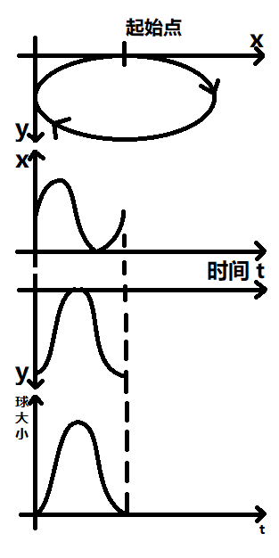
通过这张画图可以看出——
想顺时针,x 轴运动需要比 y 轴运动提前 1/4 个周期,逆时针则延后 1/4 个周期; 三个小球想均匀分布,需要两两错开 1/3 个周期; y 轴到达最高点时,球距离最远,y 轴到达最低点时,球距离最近,近大远小,y 轴位置和缩放比是正相关。 我们动画一个周期是 6 秒,理解了这些,就可以写出相应的 animation 出来了。
animation-delay 的计算方法,第一个 x 轴方向动画,初始延迟 周期时间 / 4,每次增加 周期时间/n,y轴和缩放是同步的,初始每次增加 周期时间/n。
有了这个规律,就可以使用 scss 快速计算 animation-delay 时间了
.icon-item {
    @for $i from 0 through 5 {
      &:nth-child(#{$i + 1}) {
        animation-delay: -$i * 3.33-5s, -$i * 3.33s, -$i * 3.33s;
      }
    }
}
2.使用 CSS 3D旋转
让元素围绕平面圆形路径运动,然后将平面进行翻转,看上去就是椭圆了。不过此时旋转的元素也会跟随平面翻转,所以需要再给旋转元素的角度变换回来。
3.使用多关键帧
把动画的关键帧不断增加,小圆球沿轨道运动就会越来越精细。椭圆的坐标公式,计算出轨迹控制点位置即可:
已知椭圆的长半径a和短半径b,可以根据角度r来得到椭圆轨道的x坐标和y坐标。
x=acosr y=bsinr
@a : 160px;  // 椭圆x轴半径(长半径)
@b : 80px;  // 椭圆y轴半径(短半径)
@s : 40;  // 坐标点的数目(数目越大,动画越精细)

.loop(@index) when (@index < @s+1) {
    .loop((@index + 1));
        @keyframeSel: @index * 100%/@s; // keyframes断点
        @{keyframeSel}{
        transform: translate(@a*cos(360deg/@s*@index),@b*sin(360deg/@s*@index),);
    }
}

@keyframes move{
    .loop(0);
}